Prickly Pear Case Study
UX/UI research & design
Skills
Research & Strategy
UX/Ui design
Web design
Research & Strategy
UX/Ui design
Web design
Tools
Illustrator
Photoshop
Procreate
Illustrator
Photoshop
Procreate
Date
October 2020
October 2020
The Brief
The Prickly Pear is a local desert plant nursery and boutique that offers a unique “Pot N’ Sip” experience that is a huge draw for the business.
The Opportunity
Amid the Covid19 pandemic, small businesses have had to find creative ways to pivot in order to keep their business afloat and their customers and staff safe. This touchpoint journey was designed to make The Prickly Pear's Pot N' Sip experience as successful and smooth as possible for clients from beginning to end.
The Opportunity
Amid the Covid19 pandemic, small businesses have had to find creative ways to pivot in order to keep their business afloat and their customers and staff safe. This touchpoint journey was designed to make The Prickly Pear's Pot N' Sip experience as successful and smooth as possible for clients from beginning to end. The Solution
As a UX team of one, I took a look at how to approach and organize the user experience in a manner that was thoughtful, meaningful, and engaging for people to take part in, while providing the most value possible to them in my UX UI design thinking. After taking a deep dive into the services and experiences provided by this business, I tailored specific goals and design strategies under the lens of adapting to Covid19.Proto Personas
This case study needed to be customer-centered, considering it was contingent on creating an experience while keeping guests safe. After a lot of brainstorming, I created these two personas that would reflect the needs, frustrations, and motivators of Pot N’ Sip go-ers. These personas would inform my design decisions as I worked on each touchpoint of this case study.The Touchpoint Journey/Research


Click to enlarge ︎︎︎


The Look and Feel
The Prickly Pear already had a strong brand presence, so building off of it would be an interesting and fun undertaking. For the overall look/feel, I wanted it to be vibrant, empowering, bold, energetic, while remaining refreshing, chic, and sophisticated. The owner is a very colorful and magnetic individual, and a lot of the brand's voice comes from her and her passion for her business, so this absolutely needed to be reflected. Botanical elements are a big component, but I wanted to give everything an urban, modern twist.
now for the touchpoints! ︎︎︎
Touchpoint One:
Awareness Social Media Campaigns


Yearning for Connection
Between stay-at-home orders, there has been a notable uptick in online engagement. People are seeking a sense of connection and normalcy online, particularly on social media. Because of this, I felt the best way for The Prickly Pear to connect to their audience would be primarily through Facebook, Instagram, and YouTube.Prioritizing Safety
It was extremely important to create social campaigns that highlighted The Prickly Pear’s Covid19-safe Pot N’ Sip experience, as well as their online shopping, delivery, and subscription options. This would help guests navigate how to safely support this small business during this time of uncertainty.Utilizing Motion
Motion graphics are eye catching, engaging, and upbeat. This was a time for me to explore how fun, inviting, and compelling motion graphics could be.Touchpoint Two:
Planning Landing Page


Main Goal
The main goal of this touchpoint is to get the customer prepared for their event. This landing page is to inform them of the safety protocols, establish the expectations of hosts and guests, and allow them to feel at ease before the event day arrives. I wanted this to feel easy, stress free, and exciting I kept my proto personas in mind, especially for those who love to plan and like transparency when planning a big event or trying something new.
3 Easy Steps
I wanted to break the process down into three sections so there would be a clear and concise path to follow, while also celebrating the fact that they booked the Pot N' Sip in the first place. Designed as a 3 step process, this would help keep things nice and easy to avoid any planning overwhelm. Times are stressful in 2020 more than ever, and most feel the weight of planning an event even more when safety is a factorSeating Chart
This section is a seating chart that the guest fills in to ensure social distancing precautions while also having a bit of control over how they would like their guests seated. Once completed, the seating chart is sent to the host and is available for the customer to download and print their own copy. This ensures transparency and preparedness for both the host as well as the guests.Community Map
The second section leads into a community map that lists surrounding restaurants, cafes, shops, and other nearby events or landmarks, so the guests can easily find parking, plan a full day, and support other local businesses. This allows further transparency, preparedness, and strengthens The Prickly Pear's goal to support and grow with their community. The third section is an overview of the safety protocols for the Pot N' Sip so the guests know exactly what to expect, and can rest assured that their safety is prioritized.Touchpoint Three:
Waiting Email Follow-Up

Email Blast
At this point in the touchpoint journey, guests have booked, done their seating chart, looked over the landing page, seen the requirements, and are awaiting their event. As guests are waiting, an email blast will be sent out a few days prior to the Pot N' Sip as a final reminder to look over any necessary details.This allows customers to feel even more prepared, and it reiterates the sentiment that their safety and comfort is a priority. For those guests who may be forgetful, this will serve as a nice reminder to make sure they're ready. This encourages trust in the Prickly Pear brand, as well as keeps expectations clear for both the host and the guests. The idea is to have everyone on the same page so that all parties involved only have to focus on their growing excitement for the Pot N' Sip.
Touchpoint Four:
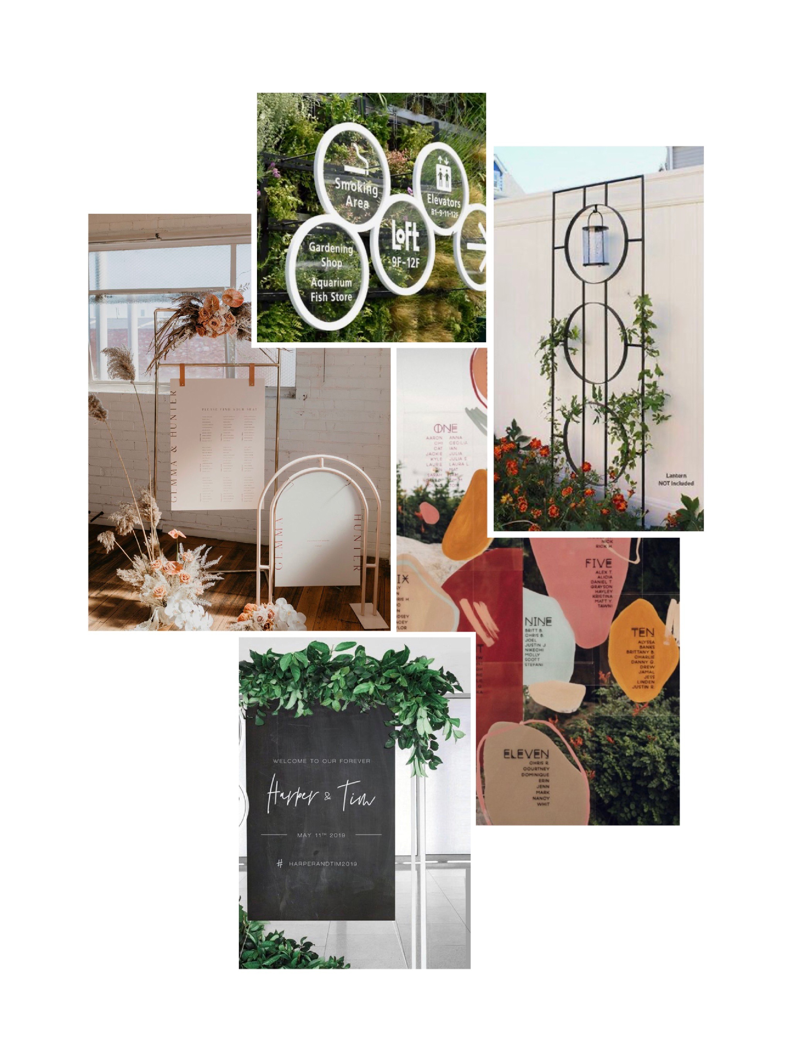
The Experience Wayfinding Signage

Current Signage
- Not up-to-date with Prickly Pear’s current branding
-
Visibility concerns due to size and visibility from street.
-
In need of a more polished, editable section for specials, store hours, messages.
Goal
- Create an identification sign that is noticeable enough for visitors to easily locate the nursery, while remaining mindful of what signage is appropriate for a residential area.
- Create pedestrian signage to help guests navigate and easily identify the shopping and checkout areas.
- Create numbered table signs that can accompany touchpoint 2's seating chart, allowing easy seating identification for guests during Pot N' Sip events.
mood board and sketches ︎︎︎

Touchpoint Five:
The Follow-Up PPE Keepsakes/Merchandise
Merchandise
For this final touchpoint, the goal is to keep The Prickly Pear and the Pot N' Sip experience fresh in people's minds after attending the event. While the Pot N' Sip experience already allows guests to take home their own potted plant, I wanted to take it a step further and send guests home with an entire goodie bag of keepsakes as well.
I thought it was important to make sure these items served a relevant utility beyond that of a simple shirt or towel. So I included PPE items that will provide the recipients the most value possible. My thinking was that these items could be used during the Pot N' Sip, to keep the experience safe, and then beyond.
I thought it was important to make sure these items served a relevant utility beyond that of a simple shirt or towel. So I included PPE items that will provide the recipients the most value possible. My thinking was that these items could be used during the Pot N' Sip, to keep the experience safe, and then beyond.
